Optimising registration flow of a digital patient portal for holiday emergencies
On behalf of several healthcare insurers Eurocross assists over 40.000 Dutch patients during medical emergencies abroad. Before the release of their patient portal (DiDo), every touchpoint was a phone call. DiDo allows users to safely share more information about their condition, conversations with professionals and receive updates on their case.
Analyse the existing registration and login flow to identify opportunities which block users from activating and logging into their DiDo. The number of active users should increase as a result.
As a healthcare organisation, the legal requirements around medical information in digital environments should be taken into account.
In addition, when the project started stakeholders already had a clear desire for biometric authentication as a solution. Guiding the stakeholders to look beyond this was important and important part of the project.
I started the project as a Product Designer with Lead. His focus was stakeholder management and being a sparring partner. As the nine week project progressed, he stepped to the background since he felt I was managing well myself.
- Analyse the existing DiDo activation and login flows. Identifying opportunities for improvement.
- Prepare and facilitate a scoping session with stakeholders to prioritise opportunities.
- Design and iterate optimisations for the flows. Present designs along the way in reviews with stakeholders.
- Prepare and conduct user tests with former Eurocross patients.
- Share learnings with stakeholders and iterate designs according to user test insights.
- Document design decisions and support development during implementation.
Optimisations included a biometric authentication flow as an alternative to SMS and email, polishing error and active state interactions, a new activation email, color adjustments to meet accessibility guidelines and onboarding flow optimisations. All validated in the usability tests and confirmed to be beneficial to the experience.
Research
Eurocross informed us that only 60% of the eligible DiDo users activated their account. Prior patient interactions highlighted SMS verification issues. A crucial step for activation and login. Eurocross asked to look into biometric authentification to resolve this and review whether there might be more holding users back from using the patient portal.
Expert Review
The expert review focused on identifying areas of improvement from the activation email to the onboarding flow. The insights were used as input for the scoping session. Together with my colleague we presented these and prioritised them through an Impact Effort Matrix.
- We expect that Biometric Authentication or other 2 Factor Authentication (2FA) alternatives help users complete registration and login.
- We expect that activating the CTA’s and rewriting error state feedback will help users move forward in their registration and login process.
- We expect that adjusting colours to meet WCAG AA accessibility standards will help users in their overall interaction with DiDo.
- We expect that rewriting the activation email will help convince users to use their DiDo.
- We expect that keeping users logged in for longer time will improve to comfort of use.
Competitor Analysis
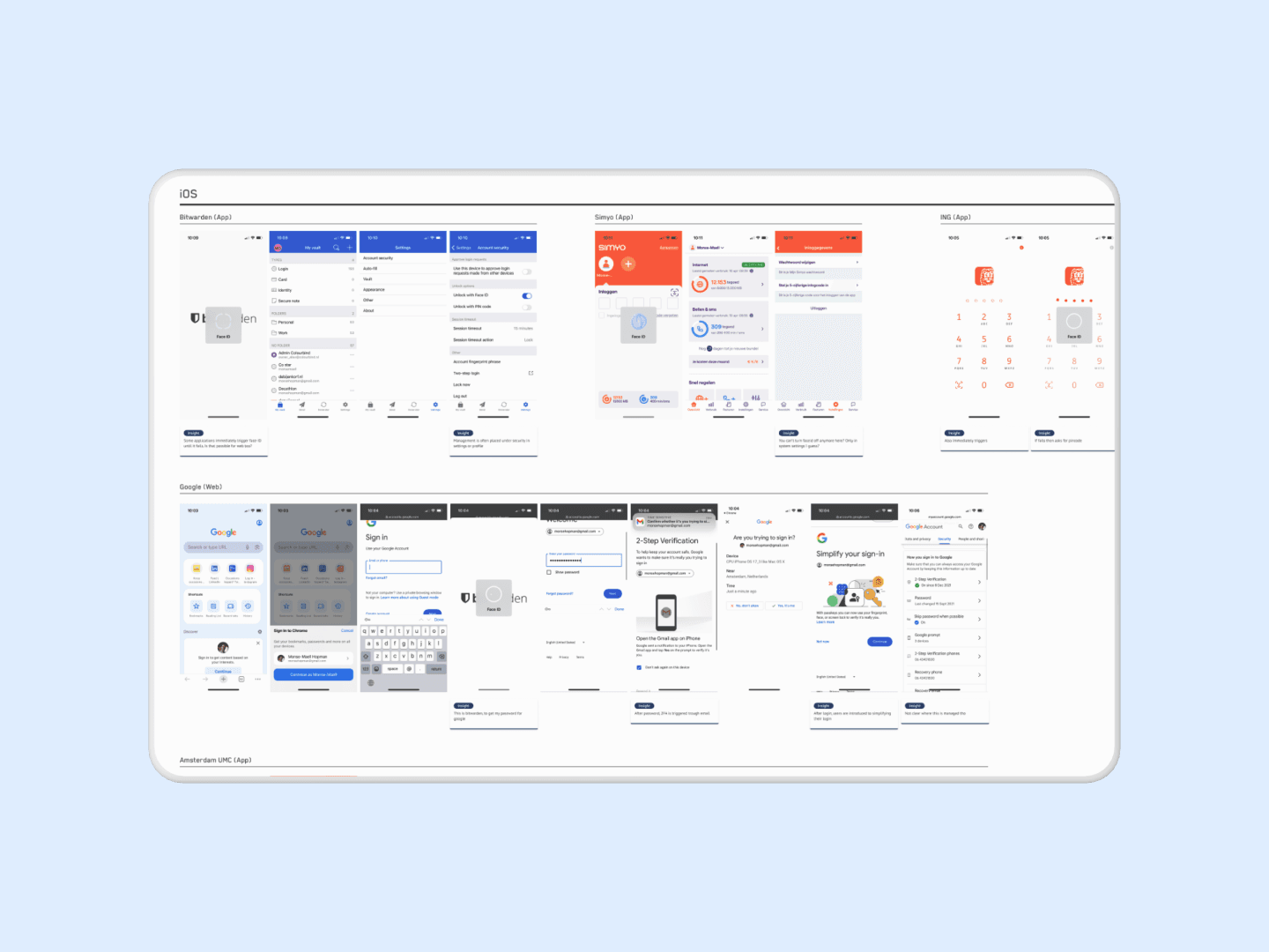
The goal of the competitor analysis was to learn how other organisations used biometric authentication, learn about requirements and discover alternative solutions. This analysis included devices beyond mobile, since Eurocross informed us patients often use tablets and laptops for their DiDo as well. The analysys contained a variety of flows from hospital patient portals to google login.
- Biometric Authentication can be used on both Android and Apple devices from mobile to desktop via WebAuthn.
- Some organisations require both biometric and SMS or email authentication, probably due to containing sensitive information.
- Authentication is often introduced in registration flows and managed via account settings.
The analysis rose some questions on technical limitations and legal requirements around healthcare information. To answer these we discussed them with the legal department of Eurocross and the development team during our first design review.
Design
Since the design primarily focused on optimisation, these were the most important adjustments in the process.
Authentication
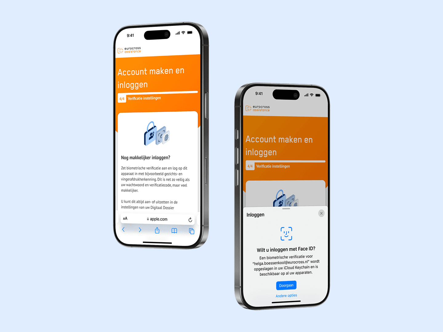
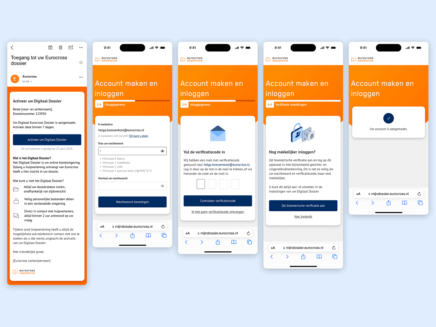
I learned in alignment with development that biometric authentication only works after account registration. It remained relevant from there, but didn’t resolve the SMS authentication issue. So I proposed to review whether email for 2FA was sufficient. I had seen this in competitor products. After aligning with legal and development we pursued this route. Which resulted in a refreshed registration and login flow containing simplified steps, better error state communication and guidance on setting up biometric authentication.
Accessibility (WCAG)
Based on insights from the expert review I proposed optimisations on the colour pallet, error state language and removing the disabled state in forms to allow users to always get feedback. Which improved the accessibility of the overall experience.
I revisited the entire activation email as well. Focusing on using B1 language as much as possible. Improving understandability for all users.
Simplification
Other core adjustments included simplifying the experience where possible. Pre-filling the users email, dropping redundant onboarding screens and removing an overkill in snackbars that cover important content.
Validation
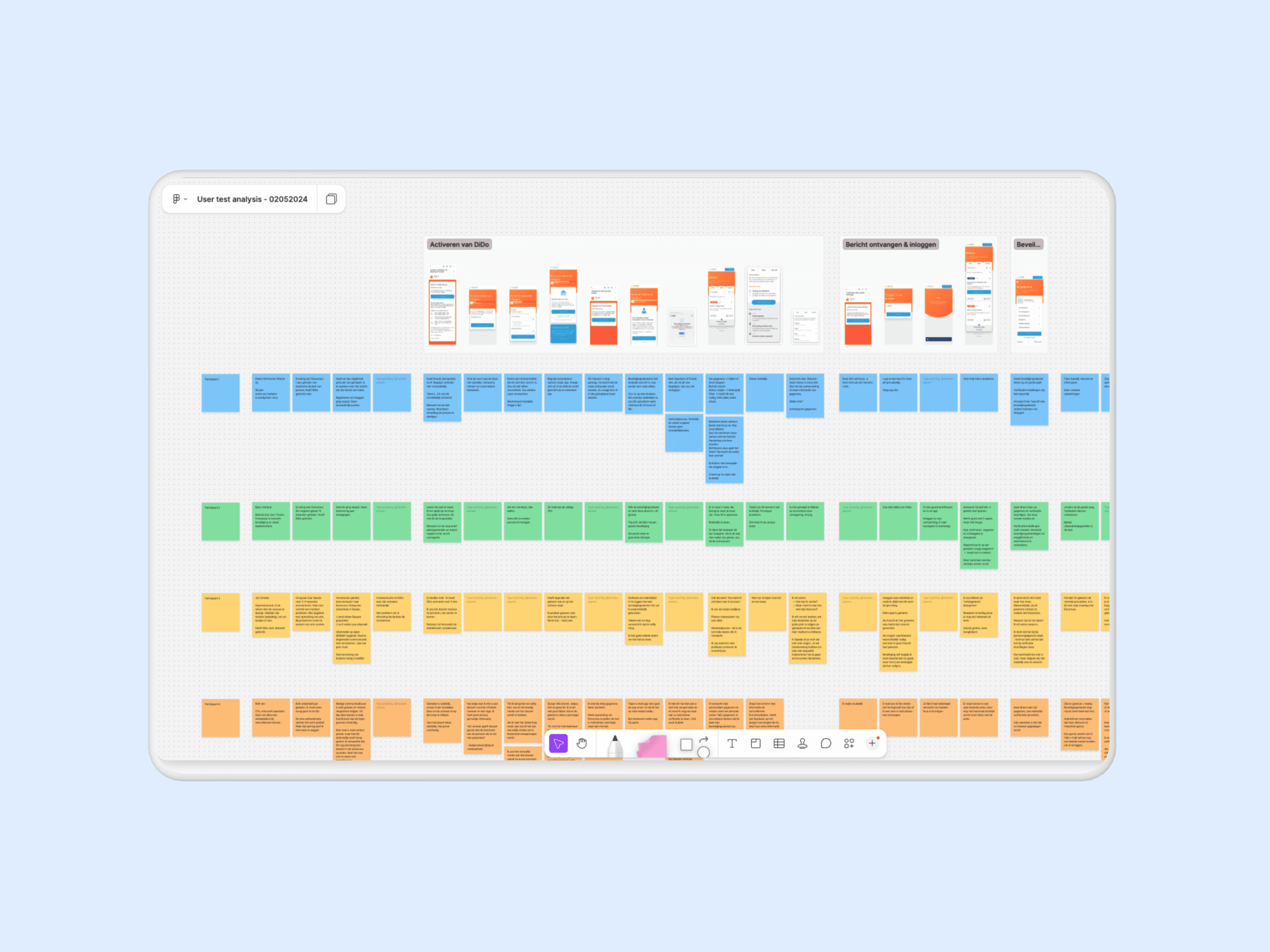
The validation consisted of a Usability Test with former patients. During the tests it was our priority to learn how users experienced the optimisations and whether they would use and understand the biometric authentication.
- Define and align assumptions with stakeholders.
- Create a script with scenarios and tasks for the user to perform.
- Fill in the gaps of the flow with additional screens and states to service a realistic experience.
- Conduct the interviews with participants and take notes along the way.
- Analyse user test insights and summarise these with recommendations on what to adjust and how.
- Present insights and recommendations to stakeholders.
- Incorporate optimisations in design iterations.
Usually, I prefer doing a script session with stakeholders to learn more about their assumptions and ideas for the test. In this case, we only had one important stakeholder and the optimisations were straightforward. So we moved on without a script session and simply aligned our outline with them over email.
- Do users understand the value of DiDo based on the new activation email?
- How do users go through the activation process?
- Do users understand and value the Biometric authentication?
- Do users understand where to manage Biometric authentication?
The outcome of the user test was positive. Users described the flows as easy to interact with and understandable. Their behaviour in the tests showed the same. Biometric authentication was understood consistently and deemed as a relevant addition. Opportunities for improvement solely consisted of small tweaks in content.
- Allow users to switch between email and SMS verification, instead of making them choose upon registration. Switching is important when a user struggles to authenticate via a certain route.
- Don’t refer to biometric authentication with the term ‘Beveiligingssleutel’. Use terms such as ‘Face ID’ or ‘Fingerprint’. These bring the right association for users.
After sharing the recommendations, the final adjustments were implemented and the design was handed over to development. Since many tweaks were small optimisations I added an update log to guide development in what had been adjusted. Preventing tweaks to accidentally be overlooked.
Reflection
This project on design level wasn’t the most challenging. However, I did thoroughly enjoy conducting usability tests myself. This was something prior employers hired research partners for. Thanks to being on the sideline previously, I did know a lot about script writing, test setups and how to neutrally ask questions. Knowledge that I was able to apply comfortably myself in this project.
Something that I would have approached differently now was how the participants were gathered. I know from prior experiences this takes a lot of effort. However, its costly to have an external party do so. Therefore, clients often want to do this themselves. Which put our timeline at risk. Having a more elaborate conversation with the client about this would’ve helped us manage expectations and improve planning.