Validating the user need for detailed shipment tracking
Maersk Go (formerly Twill) is the small business branch of worldwide cargo shipper Maersk. Their goal is to simplify the complex online and offline processes around international shipments. However, users had no real-time visibility into these journeys even though they could take months. As stakeholders doubted the need to resolve this, I researched competitors and designed an experiment to prove otherwise. Resulting in the release of a live map with over 300.000 views in the first two months.
Identify which shipment tracking insights are valuable to the core user group, with the long-term goal of decreasing support requests around this topic.
Maersk Go is dependent on the data pool of Maersk which leads to slow and unreliable data. Neither of them currently provide insights around shipment statuses, besides high-level milestones and simple email updates.
As a Product Designer in the Shipment Management team, I had end-to-end responsibility for this projects research, experiment design, stakeholder communication and collaboration with development.
A competitor analysis and a painted door experiment were used to convince stakeholders about the relevance of shipment tracking. The next step was designing a scalable first version, which could be elaborated upon after MVP release.
The painted door experiment resulted in 1,000 interactions with the core user group, validating the demand for tracking features. The MVP combined a view of the schedule and vessel location in the shipment detail page, receiving over 300,000 views in its first two months after release.
Research
The hypothesis amongst stakeholders was that tracking insights would be irrelevant to their users. The design team felt the opposite, specifically because shipment journeys often take weeks or even months. Throughout this process it’s common for delays to occur and some of these are related to required user actions.
Competitor Analysis
Understanding how competitors handled shipment tracking was important to learn about the standard in the existing market, and to build a case for stakeholders on the relevance for users.
- Which information do competitors communicate about tracking?
- How do competitors display tracking for active multiple shipments?
- Do competitors draw a relation between tracking and user tasks?
Across all competitors, milestones were an established way to communicate about shipment progress. Beyond this, approaches varied from live maps displaying multiple shipments simultaneously to vessel or container-level tracking. The depth of update information varied from delay time to extensive schedule updates, with some competitors offering both and others neither.
This confirmed that shipment tracking was already an industry standard, and helped identify the different options of information depth around this topic.
Painted door test
Based on feasibility, available data and stakeholder priorities, the experiment approach was determined. The most important aspect was that in a previous hackathon developers had attempted to create a live map already. This gave an indication of the effort required to realise a working map experiment. To simplify development and design input, we decided to run a painted door test with a banner opening a survey on-click.
The experiment ran for two weeks. Afterwards, I analysed the results and presented them to stakeholders.
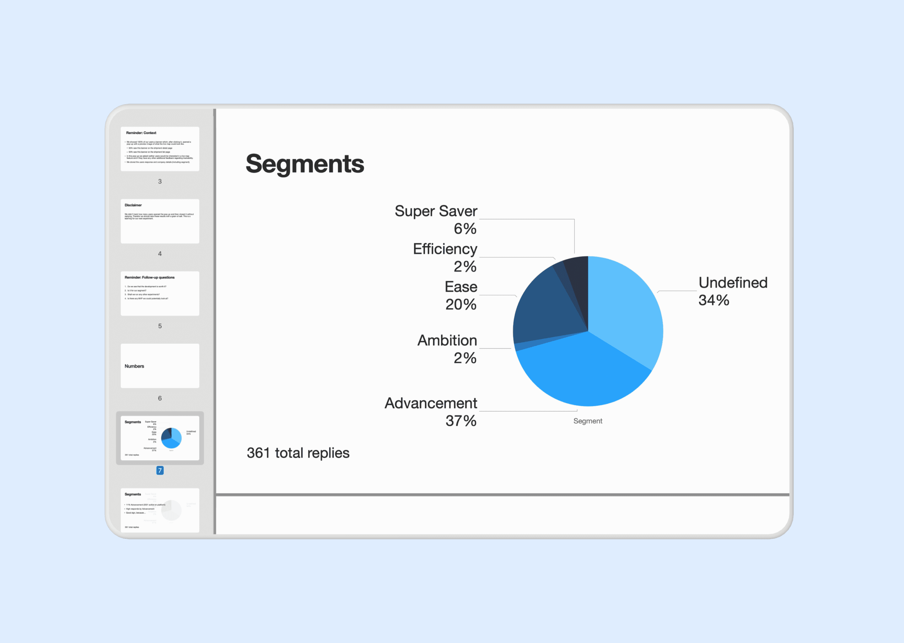
The main user segment had a 33% higher response rate compared to their overall active users. Allowing to conclude that within this group three times more users were triggered by the banner and responded to the survey. Over all segments, users that responded to the survey were positive.
These insights convinced stakeholders allow for design and build of a proof of concept.
Design
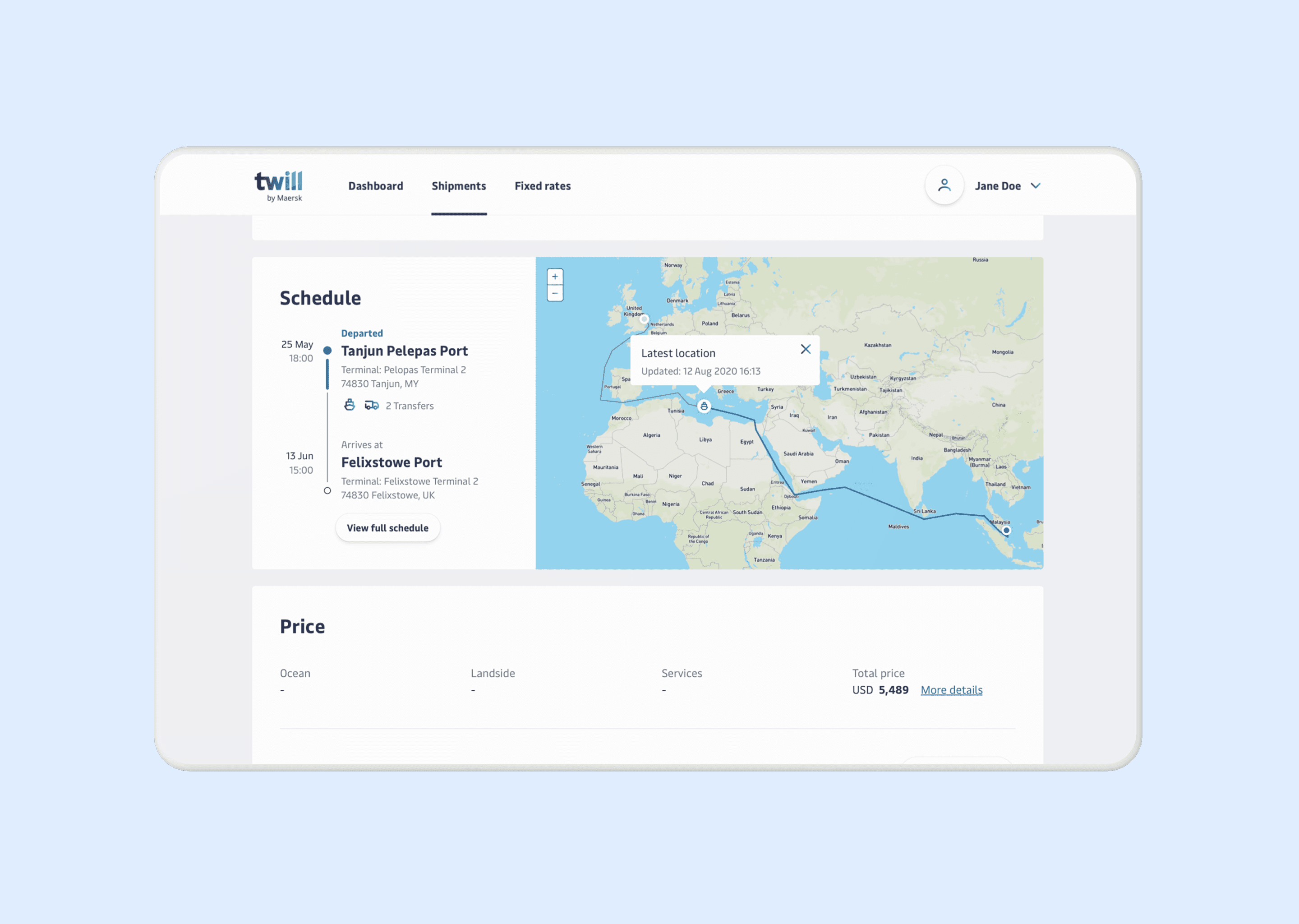
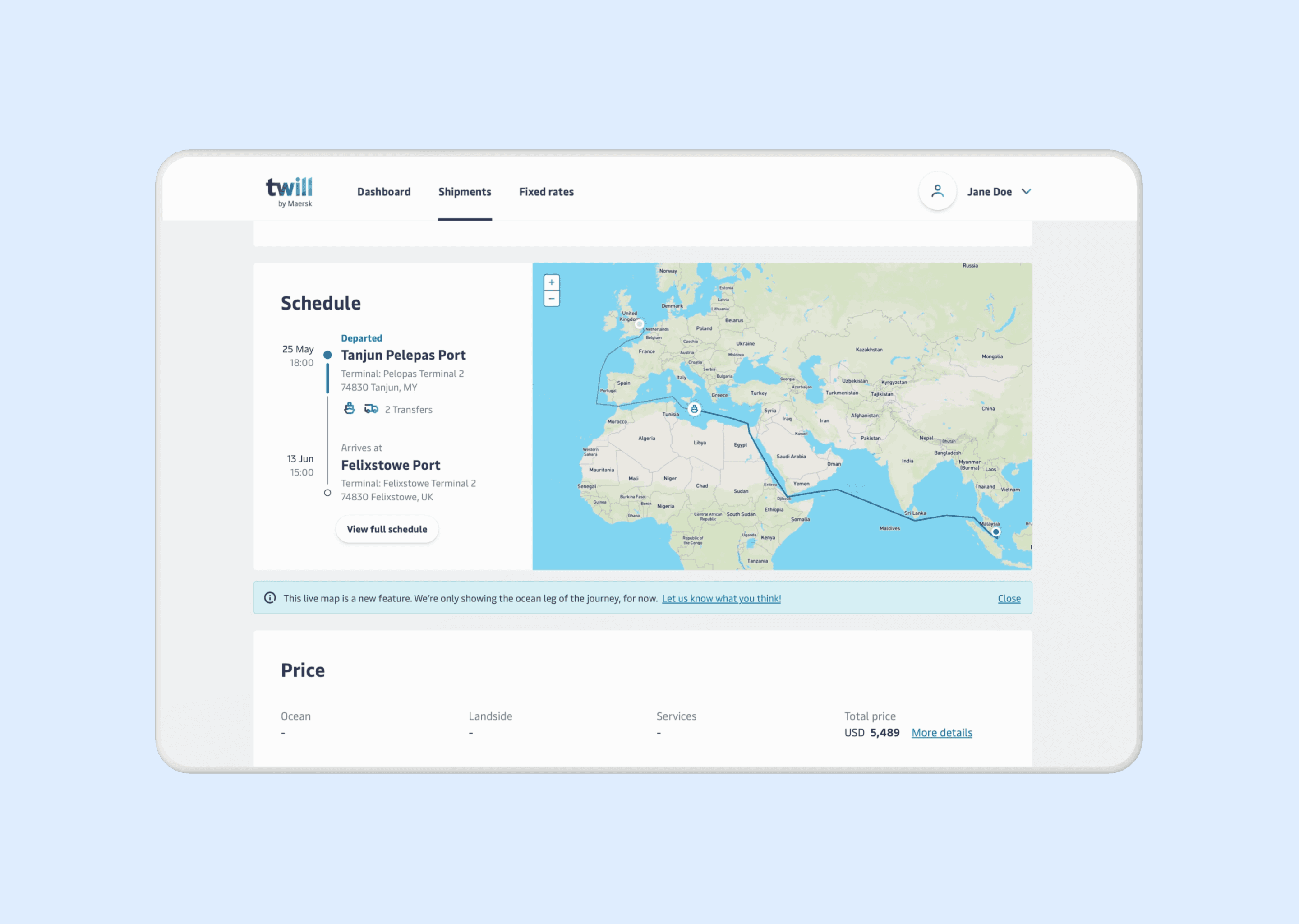
The proof of concept design focused on having a first live version to further evaluate how users interacted with the map, and learn more about information-depth desires. To remain in scope the tracking solely lived on the shipment detail page, which allows users to follow one shipment at a time.
Exploration
I started by exploring entry-points for the map. First at the top of the page in combination with the milestones and later next to the schedule component. Since creating a relation between the map and tasks was to complex for this experiment, I moved forward with the placement next to the schedule component.
I chose to display the schedule on the left. First drawing attention to the overall journey, which can also contain transportation beyond vessels. After this, users can get a deeper understanding of context by viewing the vessel location on the map.
To make sure the map naturally highlights where to focus I decided to display it in color, allowing users to quickly distinguish water from land. I included country names to help users identify approximate location. Users can see when the vessel location was last updated upon click, which in the future would allow to mention update information.
Validation
From the painted door test to release of the proof of concept, the live map was received positively. The validation primarily consisted of quantitative analysis around user interactions, duration of viewing the schedule area and support tickets in relation to tracking.
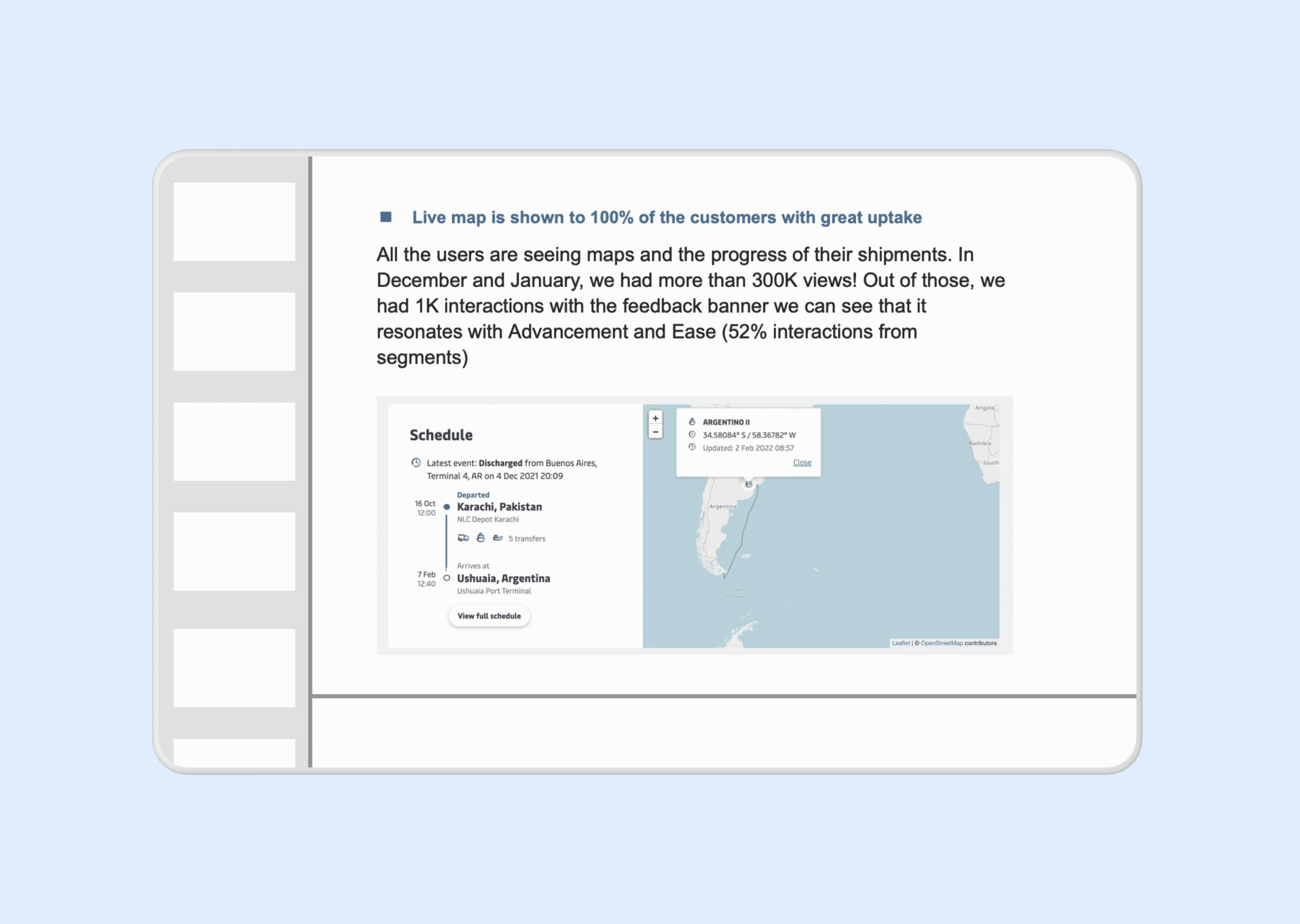
Unfortunately I left Maersk Go after the experiment was released. However, I stayed in touch with the team and learned that the live map was released to 100% of the users later that year. In December and January it received more than 300.000 views. The uptake of the live map reflects the identified desire of the core user group. The team also continued to build upon the existing design by adding coördinates and detailed cargo statuses. Validating the scalability of my initially created design.
Reflection
This project was incredibly valuable to me as a designer. I discovered what it’s like to join a multidisciplinary team and carry responsibility for a specific area in a product. The product complexity thought me a lot about covering edge cases and different states. In my team there were no visual designers and copywriters, forcing me to learn about those topics as well. Looking back, this was my first step in broadening my expertise from UX to Product Design.
One thing I approach differently now is that in my competitor analysis I only covered other shipment organisations. Nowadays, I include one or two other type of organisations as well. Specifically for inspirational purposes.
One thing I would approach differently now is that in my competitor analysis I only covered other shipment organisations. Nowadays, I include one or two other organisation types as well for inspirational purposes.
During the painted door test I learned the complexity of metrics. When running the test, we forgot to also track users opening the module but not submitting. Therefore, our data wasn’t displaying the full picture. We did inform stakeholders about this when presenting the insights. But I do know now that this was a very important metric to identify whom only opened the survey or completed it but never pressed submit.