Crafting a native Arabic digital experience
Recharge.com helps customers top up their digital credit instantly, from phone credit to prepaid credit cards and gaming cards. With their wide variety of payment options and diverse product range they operate on global scale and cross-border level.
After a successful rebrand and app launch, Recharge.com wanted to expand their market to the Middle-Eastern countries. Starting with the United Arab Emirates and Saoedi Arabia. To create an outstanding user experience, the responsive website had to be transformed into a native Right to Left (R2L) oriented platform. Ready to scale towards more countries in this area over the years.
As non of us spoke Arabic, we had to define a process to work on the designs without losing context. On top of that, we needed to understand cultural differences and how they were translated in the digital world.
Adjusting Interaction Design to R2L orientation can be challenging, since not all patterns used on the website were common patterns. Additionally, the brand identity of Recharge is all about ‘moving forward’, but it reflects the opposite in R2L orientation.
This was my first lead project for Soda studio. I worked with a team of a Visual Designer, Researcher and Art director. During these 8 weeks, it was my role to help the team remain on schedule, gather required input, create designs, document and present to stakeholders.
- Analyse established native Middle-Eastern platforms to understand common R2L experiences.
- Conduct a competitor analysis to see how digital credit providers are currently serving this market.
- Deep-dive on designing native Arabic experiences and translate these into a set of guidelines for the team to use.
- Define a workflow for ourselves and future designers.
- Design the core flow of the website experience to prepare for validation.
- Validate this flow in collaboration with national and international research professionals.
- Iterate and create additional detail designs according to usability test insights.
- Document the design and guidelines for future elaboration.
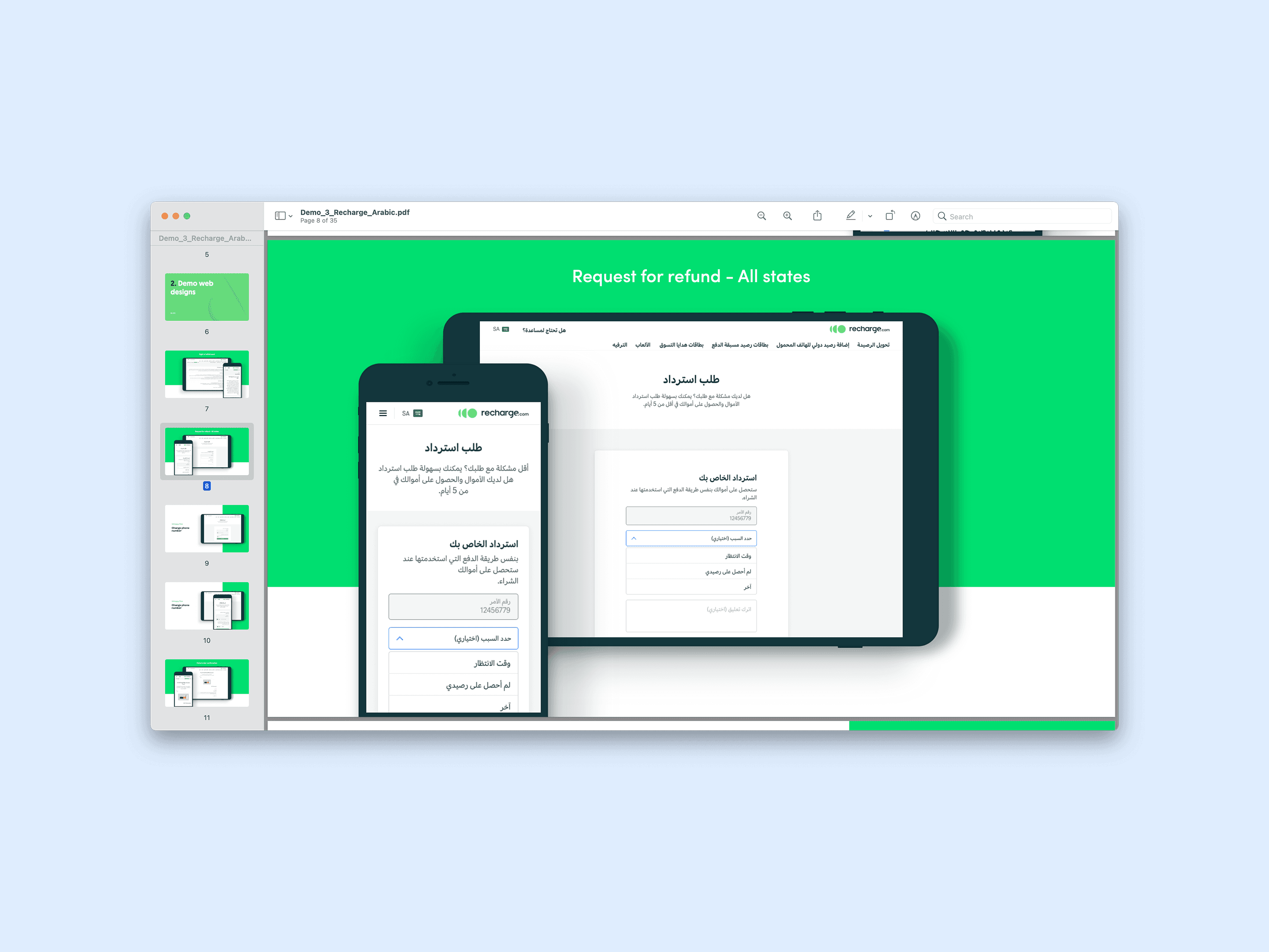
We delivered the responsive happy flow, most important error states and edge cases, and several email templates. Each of them validated by native users from Saudi Arabia and the United Arab Emirates. Our hand-over documentation included a R2L design library, workflow documentation and explained build up of complex components.
Research
I was prone to become more familiar with R2L design, native Middle-Eastern online experiences and cultural differences which translated to the digital world.
Competitor Analysis
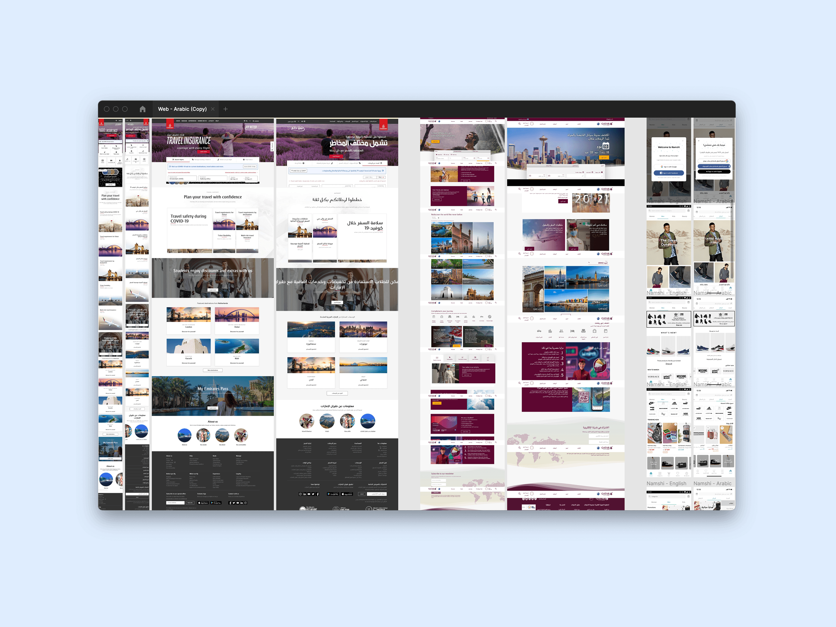
My first focus was reviewing websites that were both active in Middle-Eastern countries as in Left to Right (L2R) ones. I placed their Arabic websites next to their L2R ones to get a better feeling for interaction patterns and overall experience. After this, I narrowed my focus to competitors in digital credit services. To learn more about how well this segment currently is served and common patterns within this area and orientation.
Many large corporations don’t necessarily offer a native R2L experience. Often they get stuck in between due to solely translating text, not lay-out. This initiallay confused me, because I didn’t understand what was going on when I shifted between variants. After doing some research I found proper native experiences to compare to poorly transformed platforms.
Deep-dive
Whilst analysing I realised there was much more to designing a native experience than solely the right orientation and language. So I started reading articles about cultural differences and how these translate in the online world.
- Numbers always remain in L2R sequence.
- Arabic speaking users tend to use R2L websites when a company is located in a Middle-Eastern country.
- Arabic speaking users switch to L2R websites when the R2L website is poorly translated or designed, not meeting native experience standards.
- There are no strict guidelines in redesigning components to R2L standards.
- Icons are adjusted to R2L orientation when they communicate about direction.
Thanks to this deep-dive I learned that the digital experience of ‘moving forward’ had to be mirrored to reflect the same as in Arabic speaking countries. Which was a big deal in terms of the Recharge.com brand. So, we flagged this and aligned with the client to assure what was in scope.
Define
I gathered research insights into guidelines. Which I shared with team members and the client, after validation with a native speaker. The next step was to define a structured approach.
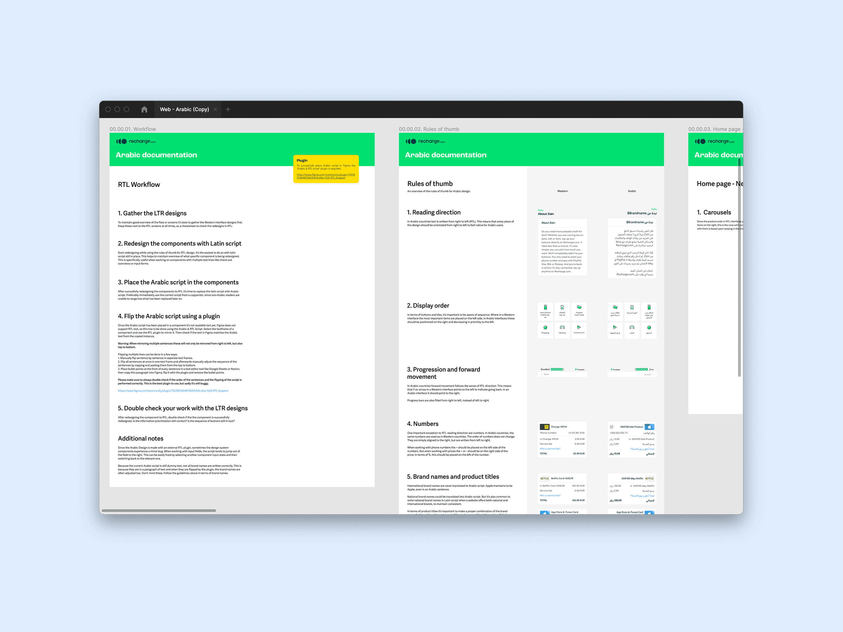
Workflow
- Gather the flow of the original design.
- Redesign component by component to R2L setup with the latin script in place.
- Place the Arabic script in the redesigned components.
- Flip the script via a R2L plugin, assuring its readable.
- Review the new components to ensure everything is as its supposed to be.
Design
We applied this approach on the core flow. Research insights helped me redesign the common patterns. However, a few components required more attention.
Input fields
When placing an order, a user needs to share their payment details, contact information and potential discount codes. Something we didn’t account for at the start was the input language. Specifically in relation to how these were stored in the database. Before flagging this to Recharge, I did some additional research on how other sites approach this. Luckily, its quite common to keep Latin script in input fields, also on R2L sites. In alignment with Recharge we learned that updating the database to store Arabic script was too much effort for now.
Of course, all the contact fields also had to be evaluated to align for things like address formats and required payment details.
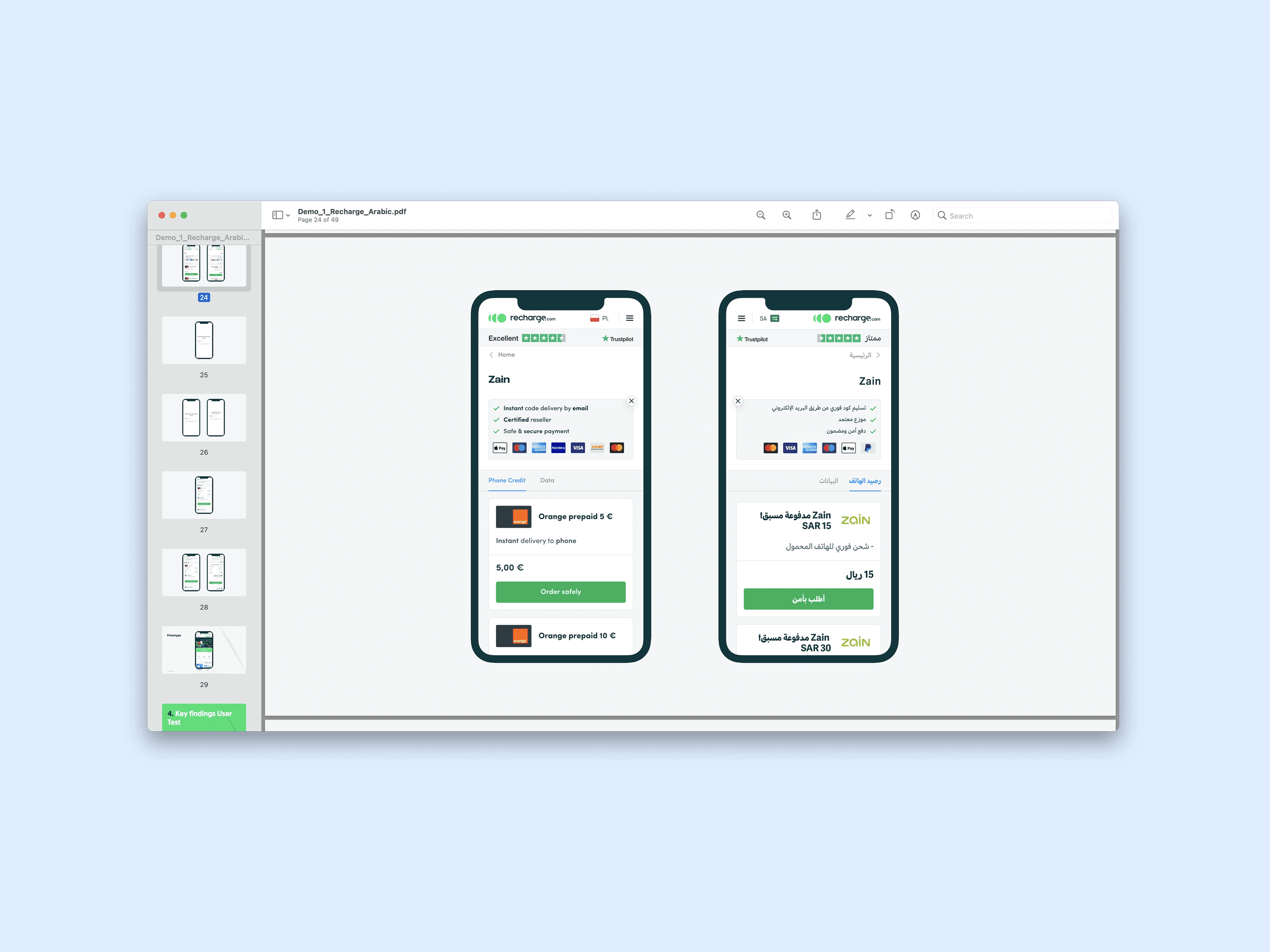
Product names
Recharge product names consist of a brandname, product type and pricing in currency to purchase. This build up was extremely important due to contractual agreements with suppliers such as Apple and Nintendo. Therefore, I carefully wrote guidelines on how the product name translation should be approached.
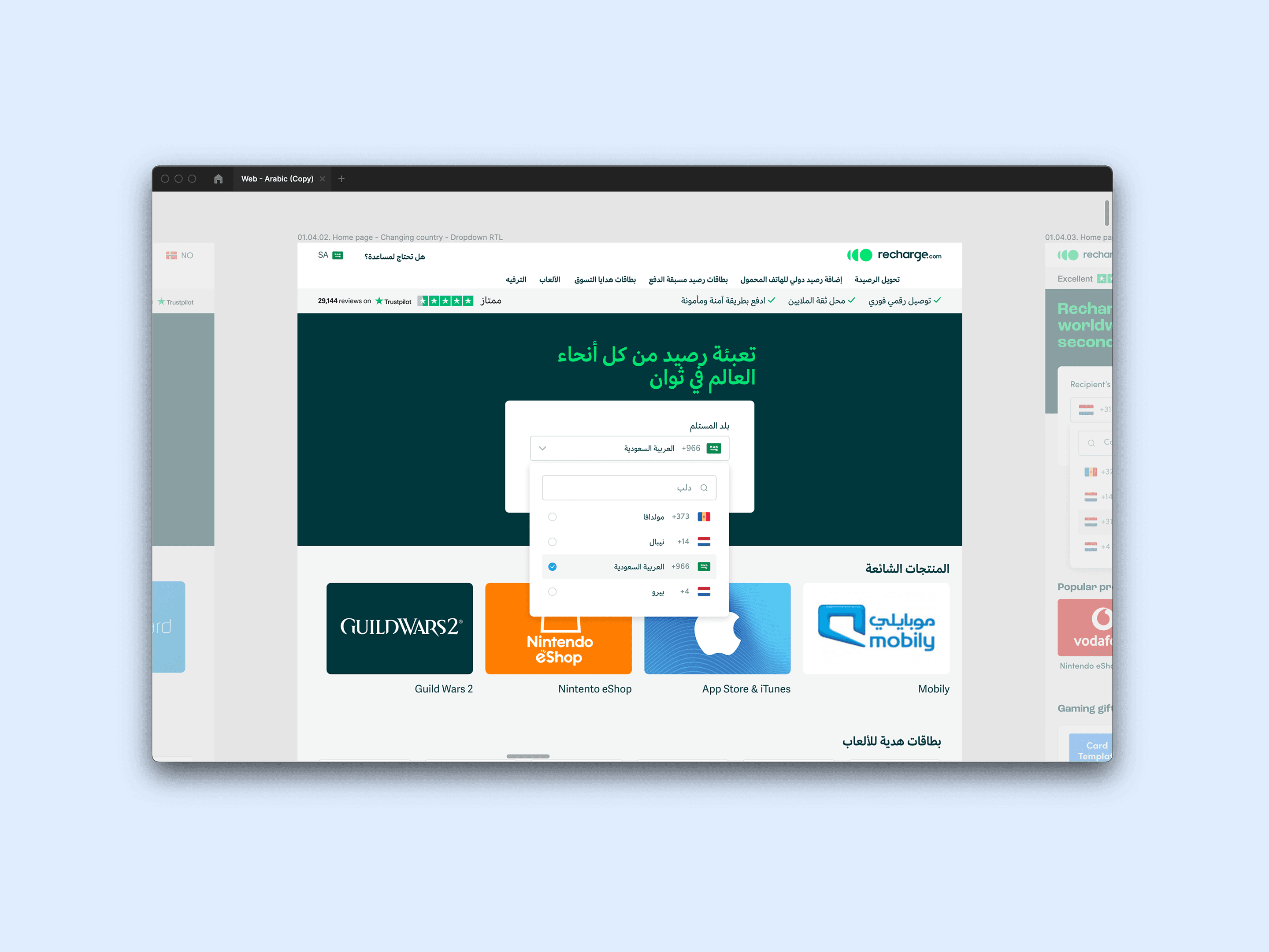
Custom dropdown
The biggest challenge by far was a custom dropdown component which includes thee pieces of information and serves as core entry point for the website.
Validation
We did pre-research on the target group and after the first sprint we validated the mobile happy flow. This was done by working together with a research agency in the United Arab Emirates. Together we ran user tests on natives from the United Arab Emirates and Saudi Arabia.
- Proper translation is key to win over users' trust
- Consistency is key so never mix language or orientation
- Middle-Eastern users are unfamiliar with service fees for digital credit top-up
Reflection
Looking back on this project, I am really satisfied. I learned a lot in the lead role, like stakeholder management, providing the right tools to colleagues to work together and staying on schedule. The client also expressed their satisfaction towards us in terms of collaborating and the final result.
During this project, the only thing we really ran into was the fact that we didn't have a native speaker write the Arabic copy. If I could do this again, I would've made high quality copy a more important part of the scope because in the end this had a lot of impact on the satisfaction of the users that we tested. This taught me that proper UX copy is very important for your design and it's validation.